Friday, 24 January 2014

1. In what ways does your media product use, develop or challenge forms and conventions of real media products?

A thriller is a novel, play or film with an exhilarating storyline that leaves the audience clenching to their seats. Commonly, themes of crime, such as murder, and espionage are to be found in a thriller.   

 There are many different sub-genres of thrillers that include action, conspiracy, crime, and disaster etcetera. As a group we decided to choose crime/conspiracy as our feedback from our target audience told us this was the second most popular thriller genre.  We designed our thriller to be set in a dystopian past in which the audience would have our take and an insight into how the world would be different if Germany had the won the Second World War. We wanted them to feel involved in this dystopian world as much as possible and chose to include perspectives from both first person killer and victim; in addition we used shots that would overview this comparatively. To make these ideas that we had really stand out we had to ensure what could be filmed respectively to the time period, was done so.

For different sections in the scene we used different shot types and typical thriller conventions to emphasise the action. A common theme throughout our thriller was the use of cutaway shots. We placed them at intervals to emphasise certain objects, such as the killer’s boots and leather gloves, and so that the audience notices key objects perhaps more than the victim does. We also encompassed high-angle shots including one on top of the victim’s car targeting him, as this hints to the viewer that he is in fact the vulnerable one in this scene. Vital types of camera shots we used were point-of-view, as mentioned, from the killer and the victim. However we used them both differently to create alternate effects. The killer’s point of view was essential before the ‘strangulation’ scene to impose on the audience a sense of what is to come whilst still remaining mysterious. It is only when the killer strikes that we see the victim’s point of view. This puts the viewer in his shoes and shows first-hand what his reactions are.


In order to build upon and maintain tension and panic throughout the strangulation scene we needed to use a series of shot types and fast-cut editing. The Bourne Identity was a major inspiration here as a typical action and mystery thriller. We took our victim and killer and positioned them in a confined space where it appears (rightly so) that the victim would have less chance of escaping the attack. We filmed numerous different shot types that we were able to use for short periods of time, for example one second and placed them sequentially in our editing timeline to create and sustain panic, suspense and tension continuously throughout the strangulation scene. Furthermore we chose rather than to slowly build tension earlier on in the scene to instead promptly start the action. The effect of this on the audience is that they do not see it coming and so there is more an element of surprise.
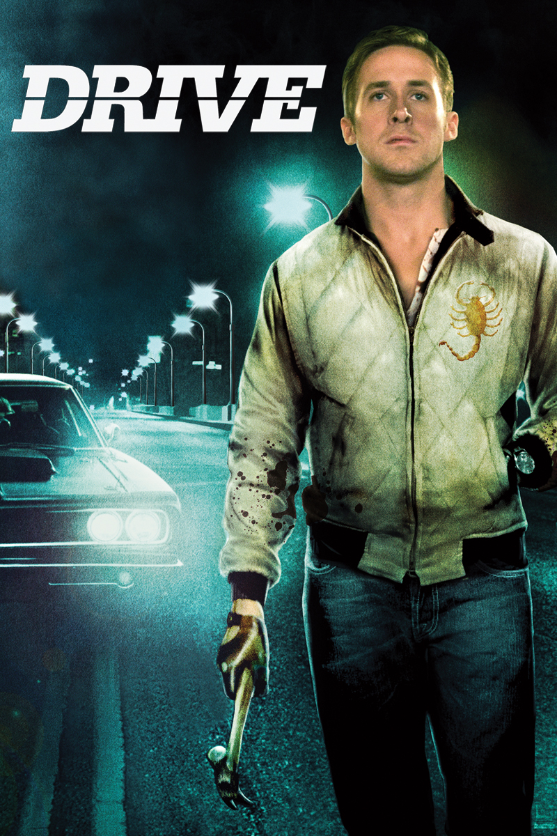
The soundtrack for our thriller took a key role in linking the video together and adding to the different emotions we wanted to portray. To begin with we chose a song from the movie “Drive”, which was also an inspiration for our movie, called ‘Tick of the Clock’ by The Chromatics. This film inspired us because of how calm and focussed the protagonist is able preserve himself whilst in threatening situations. The song is a likely thriller soundtrack as it is in a minor key, it is also very simple but effective at creating tension; as more instruments are brought in, the volume increases. However this is not the only piece of music we chose to include. As the victim closes his car door the first soundtrack stops abruptly in time with the door shutting thus creating suspense. We felt that having just silence following this technique seemed unnatural and therefore added in a silent sound effect, which actually sounds like a mysterious wind and foreshadows that something bad is to come. In order to seamlessly bring our next piece of music in, ‘Je ne Regrette Rien’ by Edith Piaf, we used both the visual and sound effect of the keys in the ignition starting the car as if the music was being played on the radio. This proved to be a very effective technique and the actual soundtrack itself challenged the typical conventions of thriller by providing irony to the scene because the victim is killed to a pleasant and civilised piece of music. This is much like a Tarantino movie and in particular Reservoir Dogs in which the song ‘Stuck in the Middle with You’ plays over the top.

In terms of props for our film we used very little but in an effective manner. We used car keys as mentioned previously to queue the second soundtrack of the film, but they also serve to distract the audience from the gun in the compartment below the steering wheel of the car. This leads on to our second prop the 1952 Morris Traveller that actually serves more of a setting for the film. The car fits the time period of the film (1956); however being this old it means there is no alarm fitted, which offers no real chance for the victim to alert someone when being attacked. Inside the car we have the murder weapon that is a thick orange rope. We chose this as it is something likely to already be in the car, hence the audience does not know whether the attack was planned. We decided upon the colour orange because we wanted it to resonate in the viewer’s minds and, as it almost resembles blood. In addition it is an unlikely weapon of choice for the killer and so adds more mystery. 


We also planned to use the long length rope to create a continuous shot following the rope back into the boot of the car, where our title sequence was filmed. This is a rare technique found in films but when filmed correctly it does pay off, Hanna is a prime example of this. Hanna’s father is confronted by a group of men when he is walking down onto a subway platform, of which he ‘deals’ with. To film ours we begun by designing a French newspaper called Le Monde (also the title of the film), we used this to place images of each person in the group so that it looked like normal newspaper articles. We then filmed a continuous shot following the orange rope from the front to the boot of the car, where the newspaper was laid. This was not an easy task, as one person cannot reach all through the car to film this shot. In order to overcome this we passed the camera between two people, beginning with person 1 to person 2 and then back to person 1 again.  When filming this we used close-up shots to film snippets of newspaper combined with the images with us. In the editing process all we had to do now was add the text and freeze-frame each close-up. The font style we chose to use was American Typewriter because it has a classic look to it but it is still clear to read.

2. How does your media product represent particular social groups?


We designed our film opening specifically to portray as little about character development as we could without making the film uninteresting. Harry Preen (left above) could be compared to the protagonist of the Bourne Identity, Jason Bourne. This is because at the very beginning of the film the audience is unable to make the assumption of whether or not he is ‘good’ or ‘bad’ creating mystery and an unrevealed storyline. We chose a male for this role because stereotypically they are likely to be classed as an agent or felon and thus the audience would expect them to deal with any attack efficiently and easily. We dressed Harry in a dark leather jacket, shirt and trousers along with a gun to reinforce this assumption and also suit his role as a typical spy or even assassin. The gun also accentuates the fact that he is likely to deal with a confrontation in a comfortable manner.
In terms of camera angles we opted to use high-angle shots to portray his character as vulnerable contradictory to his clothing, hence adding mystery. Furthermore close-ups of his face show that his eyes are tired showing he might be under stress and not have slept as a consequence.
We wanted Helen Wilcock, the killer, to have little or no identity whatsoever so it would make the viewer want to watch more of the film to find out. To do this Helen wore leather gloves which not only helped cover her feminine hands but made the murder more violent as it was easier to suffocate the victim and muffle his screams for help. She also wore black boots as shown in the picture above; this helps to portray Helen as a tough character but still does not reveal her gender.


Filming this character proved a difficult task because we wanted her identity to remain unknown. However, we used numerous close-ups on Helen’s gloved hands, feet and the murder weapon to surmount this problem. Contradictory to the first statement we chose to include a small hint towards the end of the scene. When Harry has been murdered and the continuous shot of the rope begins we start by showing a close-up shot a lipstick print on his neck. This would suggest to the audience that the killer is a woman and that is her killing signature, but we do not know this for certain. As a group we decided to add this feature because the vast majority of killers in films are male and so this would be a twist on a common conspiracy thriller. There are obviously exceptions mainly of the Film Noir sub-genre where an attractive woman will use this to her advantage and cause harm to the man who becomes involved with her. The character Phyllis Dietrichson from Double Indemnity showcases the idea of femme fatale very well by manipulating her husband’s insurance negotiator to help her murder her husband. 

3. What kind of media institution might distribute your media product and why?


Our production company name, ‘Yellow Gun Productions’ was decided upon as it relates to our first media preliminary video. In this video we were asked to demonstrate the new skills we had learned and the end scene was a one-on-one pistol standoff in which the weaker opponent was shot with a banana. As continuing with the initial group we had for this task, we came to the conclusion that we wanted to use this for our future productions. In addition to this we felt that displaying just a video with no sound just seemed unnatural, therefore we chose a non-diegetic sound effect of a can ring-pull being pulled. This appeared to add more effect to our ident and helped make it more noticeable, consequently we stuck with this idea. We designed the ident as a group and brought it to life using Adobe After Effects CC. This is a professionally used program to create animation and special effects in films.


The production company’s responsibility is to produce, promote and sell the film that is produced. They are also in charge of finding a director and a large part of casting. Obviously included in the role of production is the scheduling and scripting of the film, not only this but they must also calculate the financial side of the film too.


I have chosen Universal Pictures/Studios as although they have produced several films in a different genre they have a huge range of movies some of which are thrillers and in particular, being the most well-known, The Bourne Trilogy. In addition to this, Universal have produced films such as the 1991 Cape Fear Remake, Psycho and Zero Dark Thirty. The Bourne Trilogy films and Psycho not only had a major influence on the methods and techniques we used to shoot ours but also are very successful.


Universal is an American motion picture studio that is known for its diverse volume of films that have been being produced for nearly a century. They are based in Universal City, California and are one of ‘the big six’ production companies still going today, the others including Warner Brothers, Paramount Pictures, Walt Disney, Columbia Pictures and 20th Century Fox. Comcast now own and run Universal Studios including the production and distribution of films and also the (American) theme parks.


Funding a film such as ours we would expect to not need a huge sum of money. Because we would not be using a great deal of special effects such as massive explosions and professional animation but rather using storyline, excellent camerawork and editing to bring the film to life, it means that the cost of paying someone to do these effects is very little or none at all. Nevertheless for a film based around the methods above we would require a very good cast for the movie to have a good impact on our target audience. Although this being true the number of actors would also not be too great, lowering the budget again. For the money we would need to create and produce a film like ours we would have to rely a great deal of funding it ourselves as we are a miniscule production company, in comparison, and a large investment would be hard to acquire. However pitching the ideas we have and the introduction should be a viable option for investors. This would hopefully take a percentage of the budget away in return for a slice of profit. If this was to not work as anticipated and most of the budget did have to be funded ourselves this would not necessarily be a bad thing as the profit margin for our production company would be greater.
In a major film production company there is commonly one person assigned to a specific task. However due to the small group number, being four, each member was forced to take on and carry out multiple roles within the production team. The problem we were left with was that no person had a specific role and therefore when we created our titles we chose to just show each members name. Examples of the jobs that you would likely to see in the opening titles or end credits of a film would be:

·         Director

·         Script Supervisor

·         Line Producer

·         Production Manager

·         Production Accountant

·         Location Manager

·         Director of Photography

·         Camera Operator

·         Lighting Technician

·         Production Designer


4. Who would be the audience for your media product?

We were able to identify our target audience’s needs by creating and carrying out research, such as questionnaires. We then collected the results from this research and analysed it carefully by producing data diagrams, such as pie charts, helping us to come to evaluate the elements that we should include in our production. Our target audience is 16-23 year olds because our intentions were to target it at students studying media as they can observe the techniques we used. On top of this the audience should be able to understand the topics used in the film, for example espionage and murder, and the complex plot. In addition to this we would expect this type of film to be of interest to this age group.

The questionnaire that we created included 15 questions all relating to our sub-genre. Questions asked were similar to the one above and others quizzed topics like specific sub-genres and what works well in a thriller in your opinion. We wanted to retrieve a large amount of data from this questionnaire to make it more reliable and so gave it to several people in our media class and other media classes from other schools. Not only that but we also sent some copies to Bath University for media students there to give us their feedback.

This proved to be a very useful form of research and we were able to make educated assumptions from it. We found that the most popular sub-genres of thriller are conspiracy and psychological, as expected. This helped us as a group to choose the conspiracy sub-genre to base our film on; we decided that this would be a little different from the ever-so common psychological thrillers. Another very useful piece of feedback was in response to ‘the key things that grab your attention in thrillers’. As shown in the chart above the more popular choices were characters, editing and costume, this was a great response for us as a small production team because of the low budget these were going to be the subjects we would rely on the most.   

We also gathered from our research that our film would be more appealing to males. This was neither a great surprise nor setback for our team as it is a conspiracy thriller. Similarly the Bourne Trilogy and James Bond have this demographic and are still both extremely popular films. Here I have created an audience profile for the kind of person we would expect to watch our film.

  
Demographic
Answer
Gender
Male
Age
20
General Interests
Media, music, film, editing, photography
TV Interests
Sherlock, Breaking Bad, Dexter, Prison Break
Film Interests
The Bourne Trilogy, James Bond, The Machinist, How I Live Now, Drive
Music Interests
Electronica, Rock, Classical
Use of multi-media
Social networking, Web-surfing, Netflix/Lovefilm
Class
Middle

The BBFC (British Board of Film Classification) would be a 15 for our film. This is because it contains strong violence such as the strangulation in the opening scene. According to the BBFC website this is allowed in a 15 movie but ‘it should not dwell on the infliction of pain or injury’ of which ours does not.  This obviously impacts as a whole who would be able to watch our film, however it does not affect our target audience, as it is 16-23 year olds. This violence would likely be frequent throughout the film, had it been complete. For the BBFC to classify our film as an 18 in our instance there would need to be ‘very strong violence’ with ‘strong blood and gore’ and probably ‘frequent strong language’. If our film was to be rated an 18 because of any of these reasons it is quite possible that the group would consider cutting video to keep to our 15 rating. This is mainly because of the effect it would have on our target audience; not being able to watch it. One of the main purposes of our film is to explore and challenge typical thriller conventions to benefit other media students therefore rating the film at 18 would be largely disadvantageous.

5. How did you attract/address your audience?


By carrying out the research previously mentioned we were able to take the data and assess it to produce a thriller opening appealing to our target audience.

 
The use of close-up shots in our film is vital to the overall look. This opening shot would attract the audience because it is very mysterious; the only information the audience can make out is the date and year of when the film is set. In addition the rope in the background is an ominous addition and foreshadows the victim’s death.


Our production was able to make the victim appear more vulnerable at certain points than others. This shot here is an example of this as we can see the victim looking around as if something is watching him. In addition the camera looks down at the character emphasising his exposure, something that would attract the audience.


The shot on the left demonstrates the killer’s point of view, although the audience do not know it yet. It adds suspense because it implies that someone is in the back of the car watching the victim enter it. This attracts the audience because it hints of what is to come whilst remaining mysterious.


This is another good example of close-up shots in our film. This specific shot accentuates the fight that the victim has to put up; you can see this because of the strain in his hands. It also accentuates the thought that the killer has gone to by wearing leather gloves, both muffling sound and helping to suffocate him. This shot would attract the audience because it is very graphic violence, which intrigues people.


Our questionnaire results told us that the audience like an element of mystery, therefore this shot should entice the audience. The lipstick-print suggests that the killer is a woman however we do not know this because they are never shown fully. Also, we chose red for the colour as it symbolises blood and would hopefully ‘stick’ in the audience’s minds.   


The non-diegetic sound that we used for our production has a vital role in not just linking the video together but also attracting the audience’s attention and interest. The opening soundtrack to the scene was stereotypically minor and used chromatic notes to build suspense and create tension.  The second soundtrack combined with the strangulation scene would definitely catch the viewer’s attention, as it is quite unique in comparison to other thrillers. It is in a major key.  Both sets of costume for each character make use of the conventional view of dangerous people. The victim is dressed in dark clothes to suit his role of a spy, however the killer’s costume includes black leather gloves, black boots and a dark hat. This would make the audience feel uneasy because of this association with danger, dark clothing and the fact that the killer is typically a masculine man. Having a masculine woman would hopefully leave the viewer feeling unnerved. 


In summary I believe that we successfully produced a thriller opening that met our target audience’s expectations. The feedback from our questionnaire told us that the favourite genres of thriller were conspiracy and psychological and we met this need by creating a conspiracy thriller. We also discovered film favourites of people that included The Machinist and the Bourne Identity. We tried to take techniques from both films to please our audience. From The Machinist we took the idea of being run down and lack of sleep to add character to our victim. The Bourne films helped us fulfil expectations for a good fight scene by using similar fast-cut editing. We were cautious about disclosing a lot of the storyline and character development early on because this is what the audience want. Finally our target audience told us that we should create ‘interesting characters that betray the audience’s trust’, we achieved this by, as mentioned, not revealing too much about the character creating mystery around them and the idea of a woman killer and the supposed protagonist being killed off within 2 minutes.

6. What have you learnt about technologies from the process of constructing this product?


Filming this production facilitated my learning of both using a digital video camera and editing software to produce good quality work. I was able to learn to frame shots in order to create different atmospheres and effects, for example using close-up shots to emphasise certain key objects. I also improved upon my composing of shots to brand characters according to their role in the film, such as high-angle shots looking down on the victim rendering him to be vulnerable.  In addition to those techniques mentioned I learned more about editing video to produce a film that looked natural. The methods I built on were continuity editing, match-on-action and transitioning sections of a scene so that the final movie fits together seamlessly.

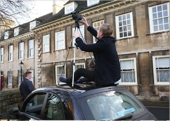
When filming on location I found out that in order to shoot video worth watching a tripod should be used to keep the shot steady and also horizontally level. The tripod we used had spirit levels to help with this; this can be seen in the photograph above. These were especially useful when filming on top of my car (image on next page). The image shows us trying out a test shot of a high-angle long pan on the victim walking down the street, which would accentuate his vulnerability and also provide a good transition shot.


In our original plan for the production we had planned to film some of the scene at night. However when we tried out some test shots for this section we found that the quality of the video dramatically decreased and affected our piece as whole as it seemed unprofessional.  In addition to this the lighting was too dark and many objects and even characters were poorly visible. To overcome this problem we filmed the entire scene in day and used a day-to-night video effect on our editing software, iMovie. This method proved to produce much better quality video and the lighting was significantly better.  


The reason for choosing our location was down to several factors. Originally, as shown in the pictures above, we had planned to film in a busy town near Bourne. However when carrying out test shots in this location we found it very difficult to not be interrupted by passers-by, cars and also objects that did not suit the time period of our film. Therefore we decided to shoot the film in a local church’s car park. Although there was other cars parked there at the time of filming we managed to position our shots so that the composition did not show nearly any of the modern cars. Unfortunately though there was one car in shot for a single take.

To begin editing our footage we first needed to import it. iMovie for OSX allows us to do this straight from within the program, this is beneficial for saving time as we can edit and import without switching between software. Using this program I learnt how to trim clips and place them together so that the video made sense to the audience, this is called continuity editing. Another technique we made use of was fade to black transitioning; I learnt that this was a useful way of changing between shots and making the video fit with the audio naturally. In addition to this I was able to use built in video effects on iMovie. We used a day-to-night effect on our video to turn down the lights and make it appear night.  We chose to use this effect rather than actually filming at night because we discovered during test shots that the video quality is much better and not grainy.

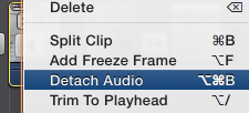
I was also able to add non-diegetic sounds to go with the video. I used the toolbar within iMovie to import music from iTunes. This allowed me to add both soundtracks. Furthermore I managed to separate the audio from video files on my timeline allowing me to trim them and used them in other places. For example the sound of the keys being put into the ignition was used for the keys going into the car door. Similarly to video, there are effects that can be placed on sound too. I used a ‘telephone’ effect on the soundtrack in the strangulation scene when the shot went outside of the car; this made it sound like the music was coming from inside the vehicle.

To produce the video suitable for playback on standard video players and websites, I needed to export the video as an MPEG-4 file. To do this I used the ‘share’ feature of iMovie, this allowed me to select the quality of the video, name it and save it as the chosen file type. We chose the maximum video quality, 1080p, so that our work could be showcased more professionally. When this had been completed we uploaded our video to our YouTube group channel, where our previous work had been uploaded also. We needed to do this so that we could display the video on our blogs and advantageously receive feedback from comments and likes.

7. Looking back at your preliminary task, what do you feel you have learnt in the progression from it to the full product?


Filming our media production proved to be a difficult task, however as a group we worked hard to improve our skills on cinematography, editing and composition to produce a worthwhile video. My erudition of the program iMovie has greatly increased allowing me to fluently edit video using different techniques that I have picked up. When carrying out this editing I additionally ascertained the knowledge to realise that the use of sound in a film carries a key role in bringing the video and production together. Furthermore I also now know a great volume of shot types and how to compose them so that they can be used relatively to the script. 


Test Shot 1
Test Shot 2


Using our media preliminary task as an example we knew that we must improve on certain elements in this video. The 180° rule is good illustration of this as in our prelim we had broken this rule.  We knew that avoiding this mistake would be difficult to do especially because the scene was set in such a confined area. To make the task less problematic we ensured that our planning for these shots were of a high standard, this included a thorough shot list and also test shots. This aided the group in maintaining the shot variety and composition, which was beneficial as we were conscious about showing all aspects of the fight scene from different viewpoints. 

Continuing on from this a technique we were keen to work on was a shot-reverse-shot. In our preliminary video we were forced to cut between shots in the final section where the two men draw guns on one another. This is because the amount of footage we had lacked tremendously. Therefore in the current production we were able to showcase this technique well by collecting a great deal of footage from either character’s perspective. We used the shot-reverse-shot method in the strangulation scene to switch between the killer’s hands on the victim’s neck to the victim’s face. Using this helps the audience to feel the action as the camera ‘darts’ back and forth creating a sense of urgency too.
 
Match-on-action
Match-on-action


Similarly the match-on-action used in our preliminary video was a little sloppy to begin with and we had to re-shoot the footage. For this technique to work well in our production we needed to plan the shots better and film three times the amount of video that we had done for our preliminary task. This proved to work well and when it came to editing the footage we didn’t have any problems with the match-on-action. We used this method for when the victim closes the car door and the initial soundtrack stops abruptly changing the focus of the film onto the victim being inside the car.


To create a storyline and idea that would work well for our production we decided to each devise a single idea to begin with. Once each member of the group had an idea we sat down and communicated them to one another, discussing the feasibility, until we had all agreed on a storyline we liked. We then took some thoughts from the other suggestions and built on it as a group until we had a set plot. In addition we planned each individual shot out as a team creating a shot list and storyboard for our production. Finally in the editing process we discussed and all worked on the video at the same to ensure that everyone was happy with the outcome.

In summary I believe that our production was a success, although some amendments could have been made to produce a perfect piece of work. The planning of the location could have been more thought out which would have saved time carrying out test shots in a location where we were not going to film. Furthermore with the help of a larger budget to make the film more realistic artificial lighting should be used in order for us to film at night, rather than using an effect. However I do believe that with the equipment and scenario we had that we successfully produced a film that showcased different editing and cinematography techniques to create tension and suspense within an audience. The video quality was very crisp and clear as all footage was shot in the day and the costuming and props we chose to use suited the plotline well. Finally the location we had chosen in the end proved itself to set the scene well and keep in the time period in which our film was set, other than the odd shot with a modern car in it.